Here’s the progression of our final infographic!

Originally we planned to keep our cruise ship in this schematic view as we were inspired by the Slagsmålsklubben (Little Red Riding Hood) music video to keep our infographic clean and simple. We were drawn to the engineering-style sketches that were featured in the video and thought they would appeal to our scientific audience.
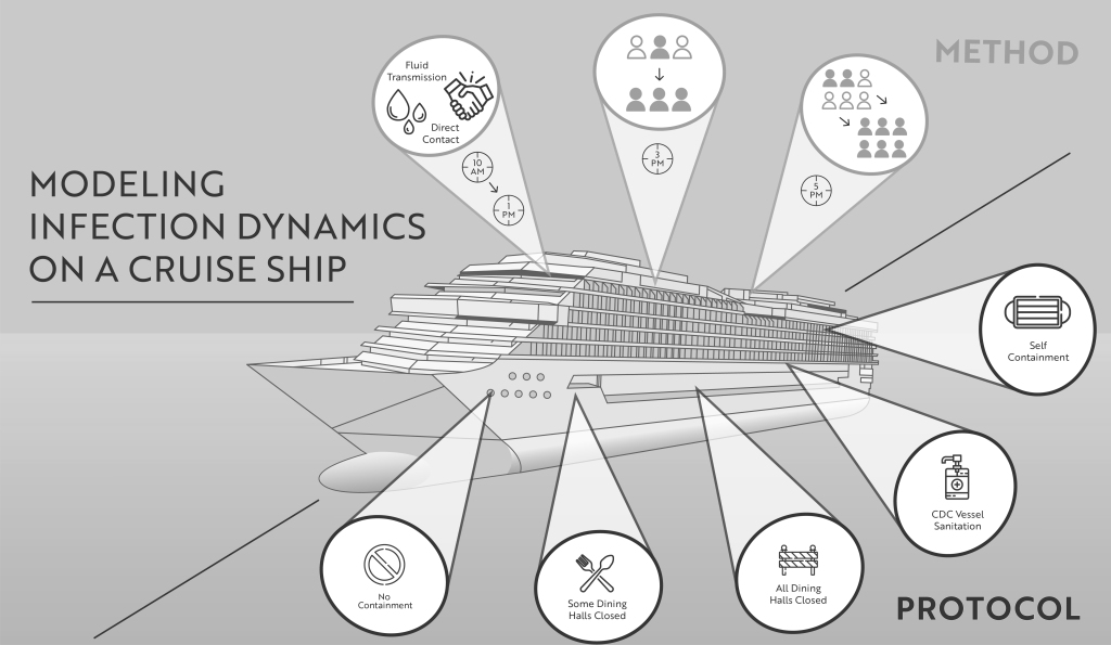
However, we decided against this direction as it didn’t convey the true three-dimensionality of the cruise ship, so we added shading.


Our final graphic revisits the color scheme we had for our original infographic (which you can check out here) as we recieved many positive comments about it.
We believe our final draft of this infographic satisfies our three goals going into this project:
- Include a 3D ship instead of a 2D one
- Include more rhetoricity
- Be a better visual representation of Professor Korkin’s methodology
We also believe our updated infographic better appeals to our audience of epidemiologists as it visually showcases Professor Korkin’s model rather than simply outlining how a disease spreads on a cruise ship, a mistake that we made in our first infographic.
A great point that was brought up in a comment on one of our previous posts was that our infographic needs to have distinct tones to still be clear if it is photocopied in black and white. To test how our infographic held up, we put it in Photoshop and made it grayscale.
As you can see, the story that our infographic is trying to tell is still clear!
Ahoy! Bonus Content!
We had a little fun while we were painstakingly creating a 2D cruise ship that was supposed to look 3D, and thought it could look cool as an actual render. Though we didn’t end up using this as the base for our infographic, we decided it would be fun to include our attempt at faking a render of our cruise ship, the SS Boaty McInfographicface. How a-boat it?

Thank you for following along our voyage!

Wow! You guys went above and beyond on the ship! It looks fantastic! I also love the color scheme,
LikeLike
Thank you Nick!
LikeLike
i really enjoyed watching your info graphic progress over time and i hope you are both really proud of your final product. as i mentioned in class i think your title is key asset to your poster as it targets epidemiologists in a discreet way. while by no means would it turn away others. great use of colors, and brownie points for using a gray scale too!
LikeLike